03 — Case study
SOUVENIR
ISTANBUL
- Brand Identity
- Creative Direction
- Photography
- Campaign Design
My RoleBrand & Creative Designer
I designed the brand identity and logo, art-directed and photographed the products, edited the imagery, and created identity applications, campaigns and marketing communications including the Valentine's Day concept.
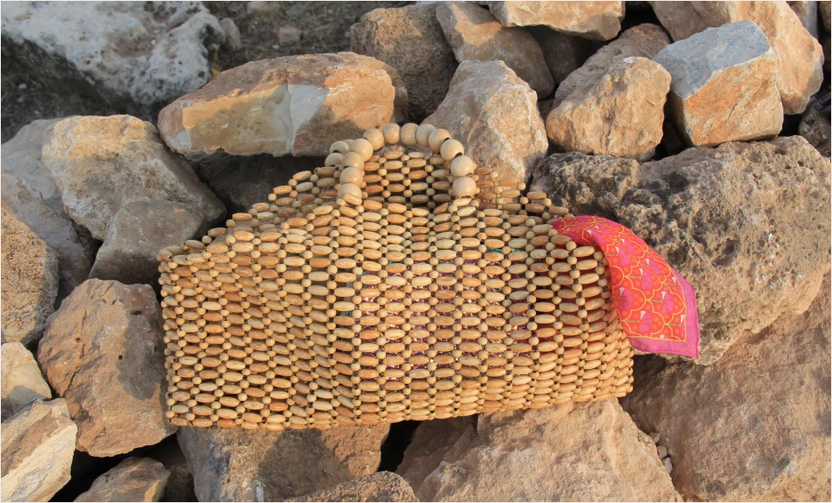
Objects with character.
Stories worth carrying.
Souvenir Istanbul is a handcrafted beaded accessories brand inspired by texture, colour, and the character of the city. I developed its visual identity and translated the brand into product photography, advertising campaigns, social content, and printed materials, creating a recognizable visual language across multiple touchpoints.
- My role
- Brand & Creative Designer
Logo & identity design · Product photography · Editing & retouching · Styling · Campaign concepts · Advertising · Social content · Printed marketing materials
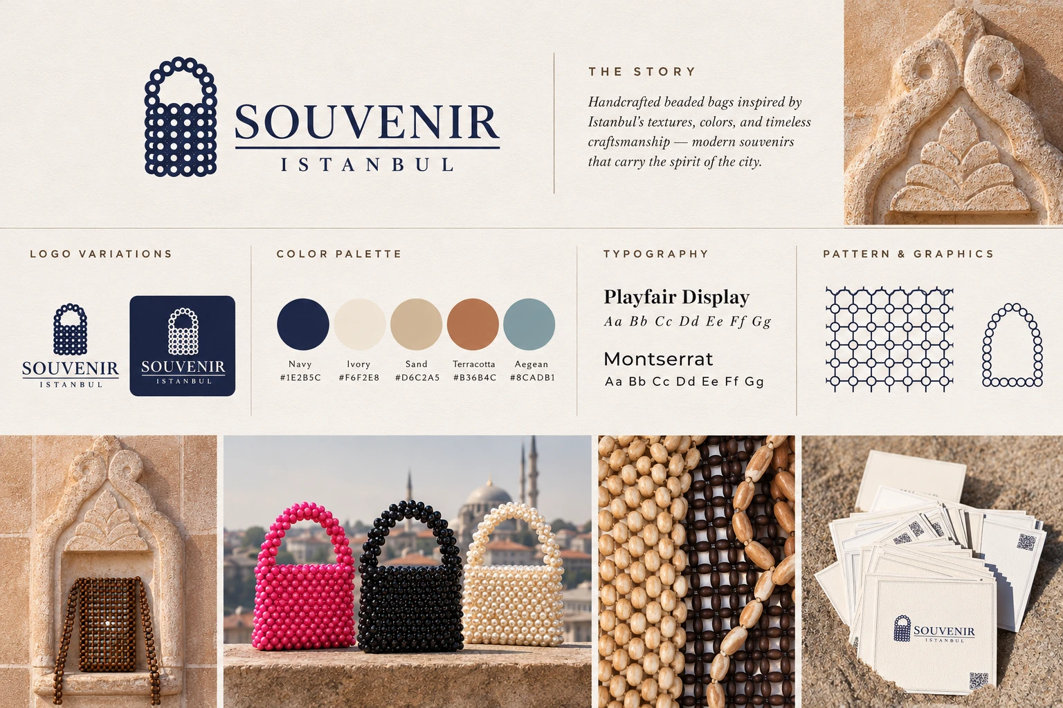
02Brand identity
An identity inspired by Istanbul.
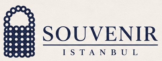
01Logo variations
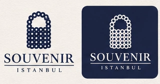
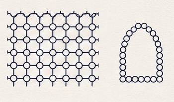
The identity draws on the construction of the product itself. Repeated bead forms create a recognizable handbag-inspired symbol, connecting the logo directly to Souvenir's craftsmanship. I translated that repeated bead construction into the logo and built the identity around it. The refined typography and navy palette provide structure, while the products introduce colour, texture, and personality.
Colour palette
Navy
#1E2B5C
Ivory
#F6F2E8
Sand
#D6C2A5
Terracotta
#B36B4C
Aegean
#8CADB1
Typography
Playfair Display Aa
Montserrat Aa
Pattern & graphic language
03Creative direction
Finding character in every setting.
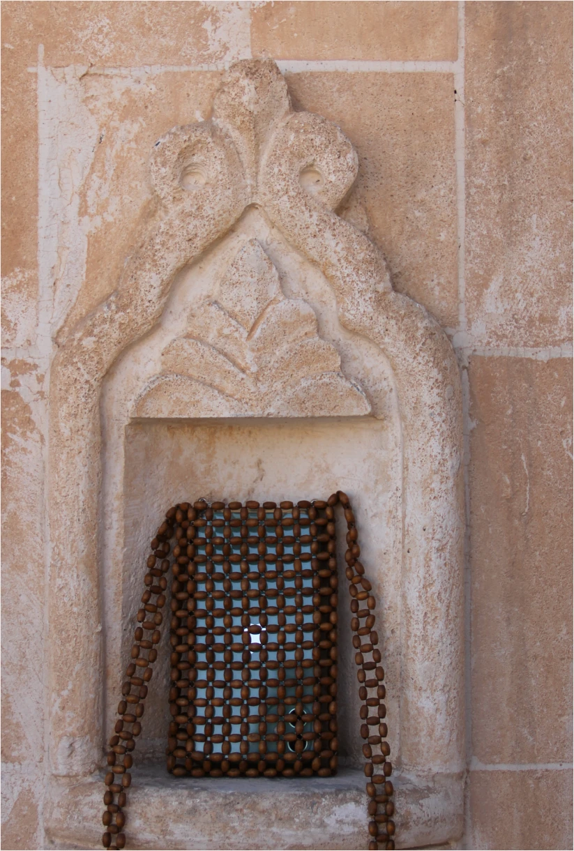
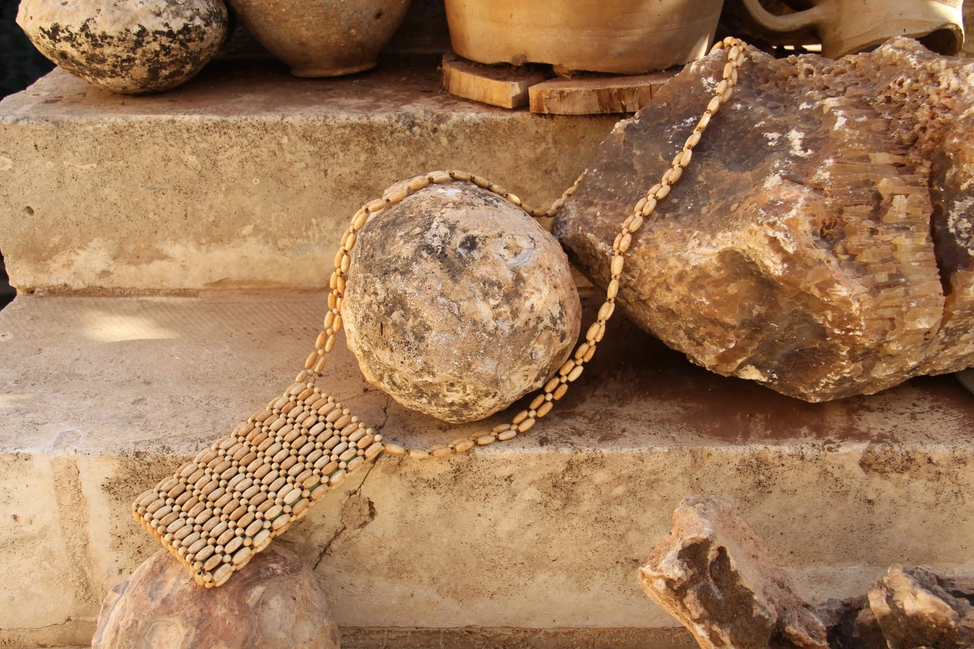
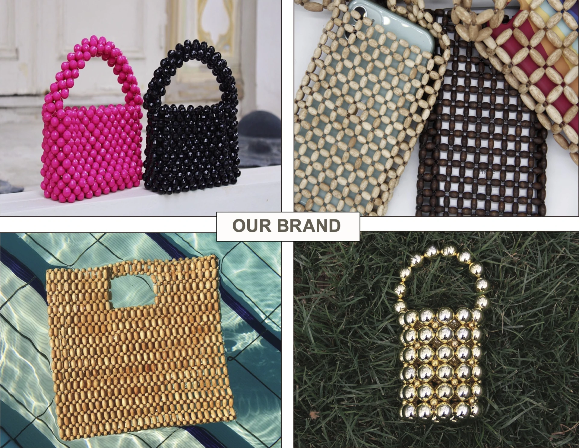
I approached product photography as a form of visual storytelling, using architectural textures, natural materials, and unexpected compositions to give each bag its own character. Contrasting handcrafted beadwork against stone, architectural details, and outdoor environments highlighted the products' shapes, colours, and tactile qualities. I selected locations, styled and photographed the products, then edited the imagery to carry that direction through.
- Location selection
- Product styling
- Composition
- Photography
- Image editing
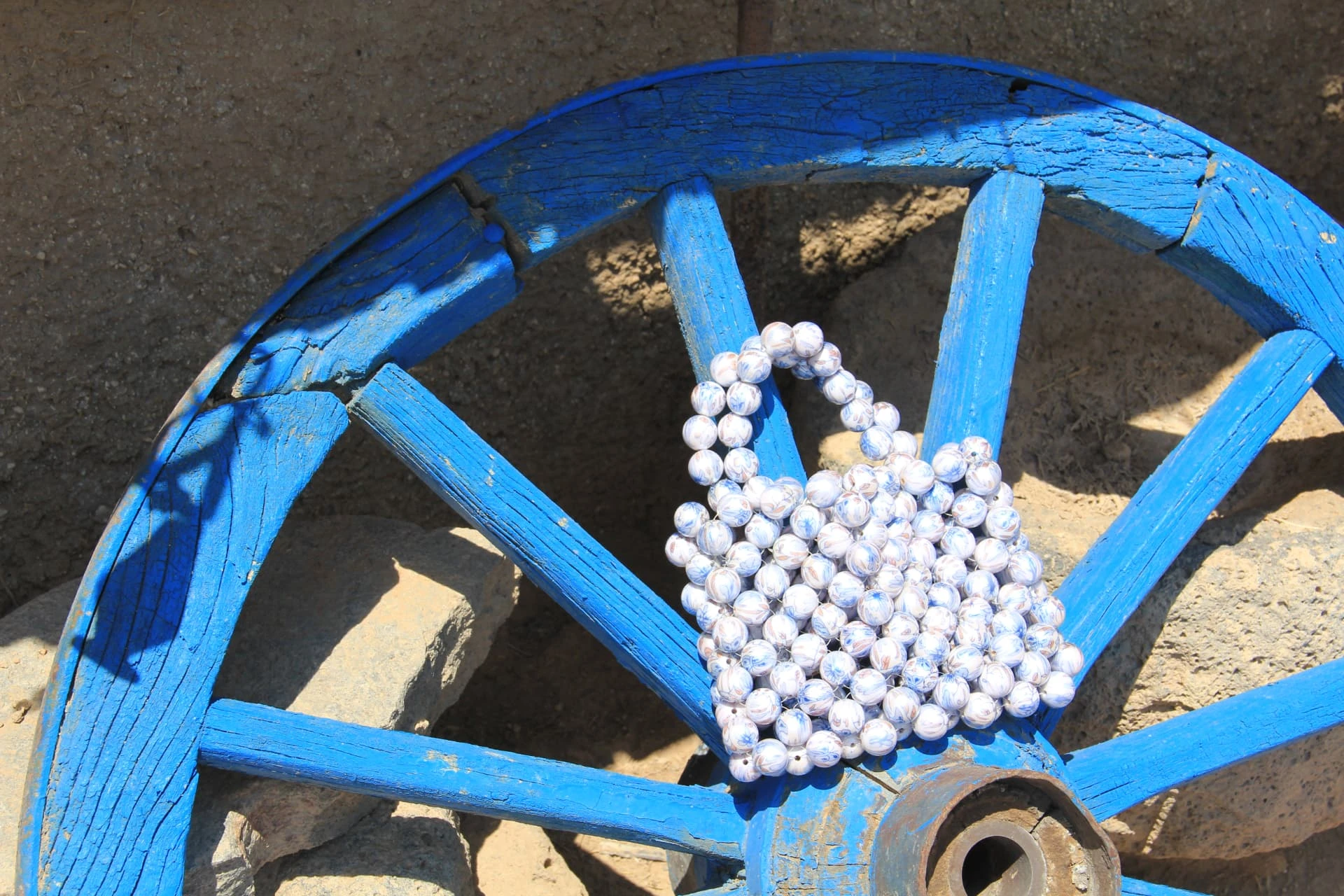
04Product photography
A closer look at craftsmanship.
05Advertising campaign
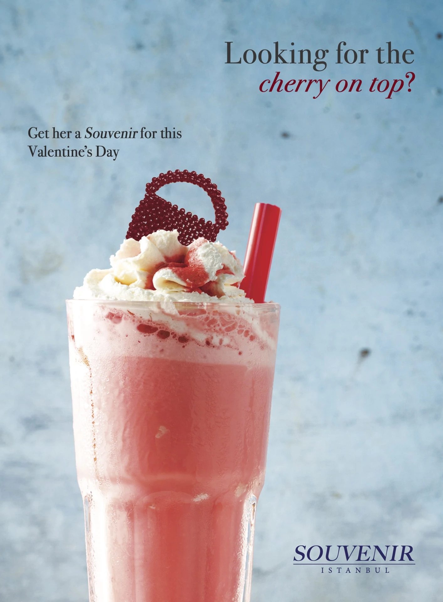
A playful twist on gifting.
Campaign concept
Looking for the cherry on top?
Get her a Souvenir for this Valentine's Day.
For this seasonal campaign, I developed a playful visual metaphor around gifting. The miniature handbag becomes the finishing touch to a dessert-inspired composition, combining product photography, graphic design, and advertising copy into a distinctive campaign visual.
Concept / Photography / Graphic design / Advertising copy
06Brand applications
One identity.
Multiple touchpoints.
Beyond the core identity, I extended Souvenir's visual language across photography, social media content, advertisements, and printed marketing materials, adapting the brand to different formats while maintaining consistency.
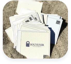
Printed brand touchpoint — original uploaded photograph
Design Decisions
Why it looks this way.
- 01
Built from the bead
The repeated bead construction of the handbags informed the brand identity and logo, turning the product's own making into its visual language.
- 02
Settings with texture
Product photography used architectural textures and carefully selected settings so each bag is seen with material and character around it.
- 03
The cherry on top
For Valentine's Day, the campaign concept presents the miniature handbag as the “cherry on top” — the finishing gift.
07Outcome & reflection
Building a recognizable visual world.
Souvenir brought together identity design, art direction, photography, and campaign development into one cohesive visual system. Working across physical products and digital marketing allowed me to connect strategic design decisions with creative execution, from the first brand mark to the final campaign image.