05 — Case study
ILYA
- Brand Identity
- Packaging Design
- Illustration
- Mockup Presentation
Beverage Packaging Identity | Conceptual study
Toronto, Canada
My RoleBrand & Packaging Designer
I created the entire project: concept, identity and wordmark, botanical illustration, packaging design and mockup presentation.
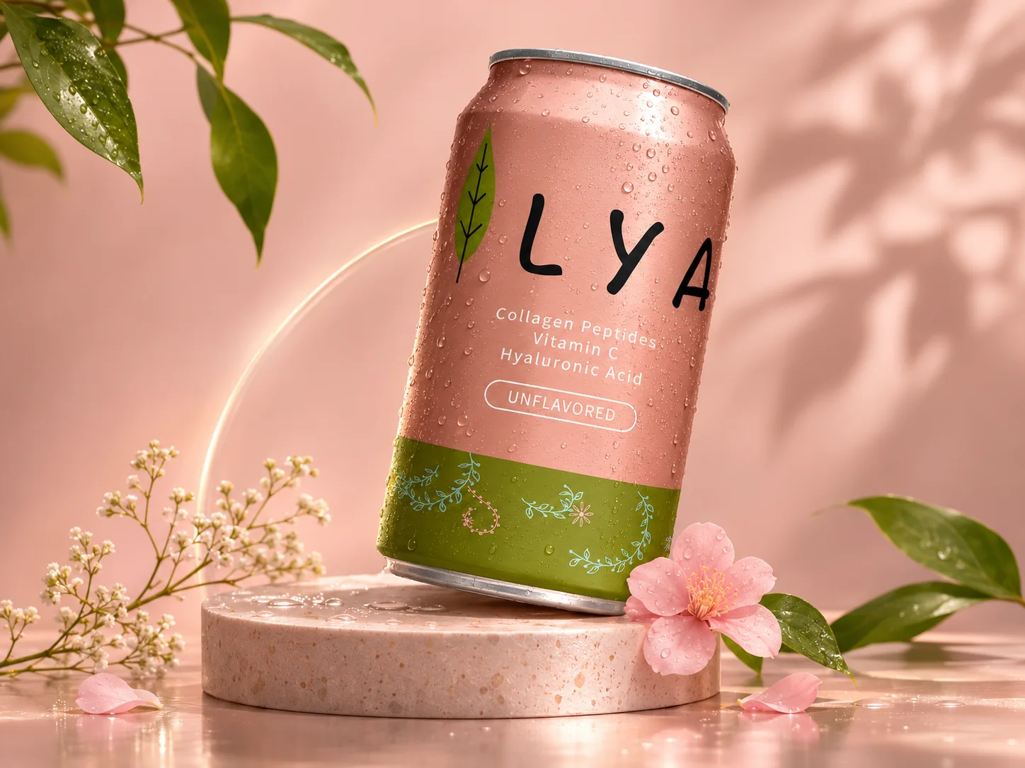
Functional beauty, focused on skin support.
A conceptual beverage identity and packaging study, with illustrative label content featuring collagen peptides, vitamin C, and hyaluronic acid.
- My role
- Brand & Packaging Designer
- Scope
- Brand concept · Wordmark & identity · Packaging layout · Botanical illustration · Colour & type system · 3D mockup presentation
Conceptual study — the can visuals are 3D mockups made for this presentation
02Brand identity
An identity that grows from a leaf.
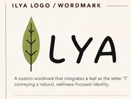
Logo / wordmark — original artwork
A custom wordmark that integrates a leaf as the letter “I”, conveying a natural, wellness-focused identity. The leaf carries the letter, so the brand name and its positioning arrive in one glance. Everything else — palette, illustration, packaging type — is built outward from that single form.
The mark is hand-drawn rather than typeset, which keeps the product feeling made rather than manufactured, and gives the botanical language on the can a source to grow from.
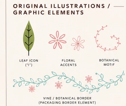
Original illustrations / graphic elements
The leaf, the floral accents and the vine border come from the same drawing hand, so the botanical language can repeat across the can without a new pattern for each surface.
Typography
The wordmark is custom hand-drawn — expressive, friendly, and natural. Packaging and product information use a clean, rounded sans-serif for clarity and a modern, approachable look, so the claim list reads quickly on a small panel.
Colour palette
Warm nudes and blushes carry the product's softness; olive green grounds the label and lets the white product claims stay legible. Sage blue and muted blush stay in the botanical line work, so colour appears as decoration rather than as extra information.
- Dusty Blush#C79789
- Nude Rose#E4B9AB
- Olive Green#7A834A
- Soft Sage Blue#A7D5D7
- Muted Blush#E8A7A8
- Off-White#FAF6EF
- Charcoal#2F2D2B
Complete identity board
The full system as presented, held on a single board.
- Original ILYA can design — front and back views
- ILYA logo / wordmark
- Original illustrations / graphic elements
- Colour palette & typography
- Early sketches / design explorations
03Early exploration
Sketches before structure.
Before committing to a layout, I explored the label in wireframe: where the wordmark sits on the can, how the claim list and flavour badge stack, and which botanical forms could carry across sizes. The wordmark itself went through several iterations before the leaf settled into the letter I.
- Can layout & label placement explorations
- Wordmark / logo iterations
- Botanical motif & illustration concepts
04Packaging design
A label that reads at a glance.
The front panel keeps three things visible at once: the brand mark, what the drink contains — collagen peptides, vitamin C, hyaluronic acid — and its flavour state. The olive base carries the botanical border, so the colour split does the sorting before any copy is read.
The back panel follows a standard layout — nutrition facts, ingredients and barcode — so the design work stays where it belongs: on the front, where the product has to explain itself.
- Wordmark placement and scale
- Product claim hierarchy
- Flavour badge treatment
- Botanical border as a repeating device
- Front-to-back panel continuity
- Mockup presentation for review
05Product visual
Colour blocking before copy.
Nude rose holds the upper body, olive green grounds the base, and the product claims sit in white so they stay the clearest thing on the can. The botanical line work runs along the border, tying the two fields together.
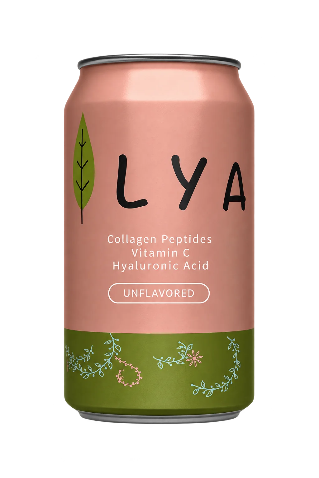
Front view — 3D mockup render
Design Decisions
Why it looks this way.
- 01
A leaf becomes the I
The botanical leaf form becomes the initial letter I of the ILYA wordmark, so the name and the illustration begin from the same shape.
- 02
Type and illustration together
Typography and botanical illustration share a soft, organic character, giving ILYA one consistent voice across the identity.
- 03
Identity carried onto the can
The wordmark, illustrations and palette are applied directly to the packaging, so the can reads as the ILYA identity in physical form.
06Outcome & reflection
One system, from sketch to can.
ILYA brought brand concept, wordmark, illustration, packaging layout and mockup presentation into one study. The leaf mark set the tone; the palette, botanical border and rounded type carried it onto the can, so the same idea holds from the first sketch to the finished panel.