07 — Case study
AYVEE’S DINER
Editorial Design / Menu Design / Print Design
Plant-based restaurant concept
My RoleGraphic Designer
I designed the menu layouts, typography system and brand story page for this plant-based restaurant concept.
01 — Introduction
Designing clarity into the dining experience.
Ayvee’s Diner is a menu and editorial layout project for a plant-based restaurant concept. The original pages bring together a consistent visual identity and clear information hierarchy across starters, main courses, desserts, wine, and the brand story.
- My role
- Graphic Designer
02 — Menu design
One identity. Across the menu.
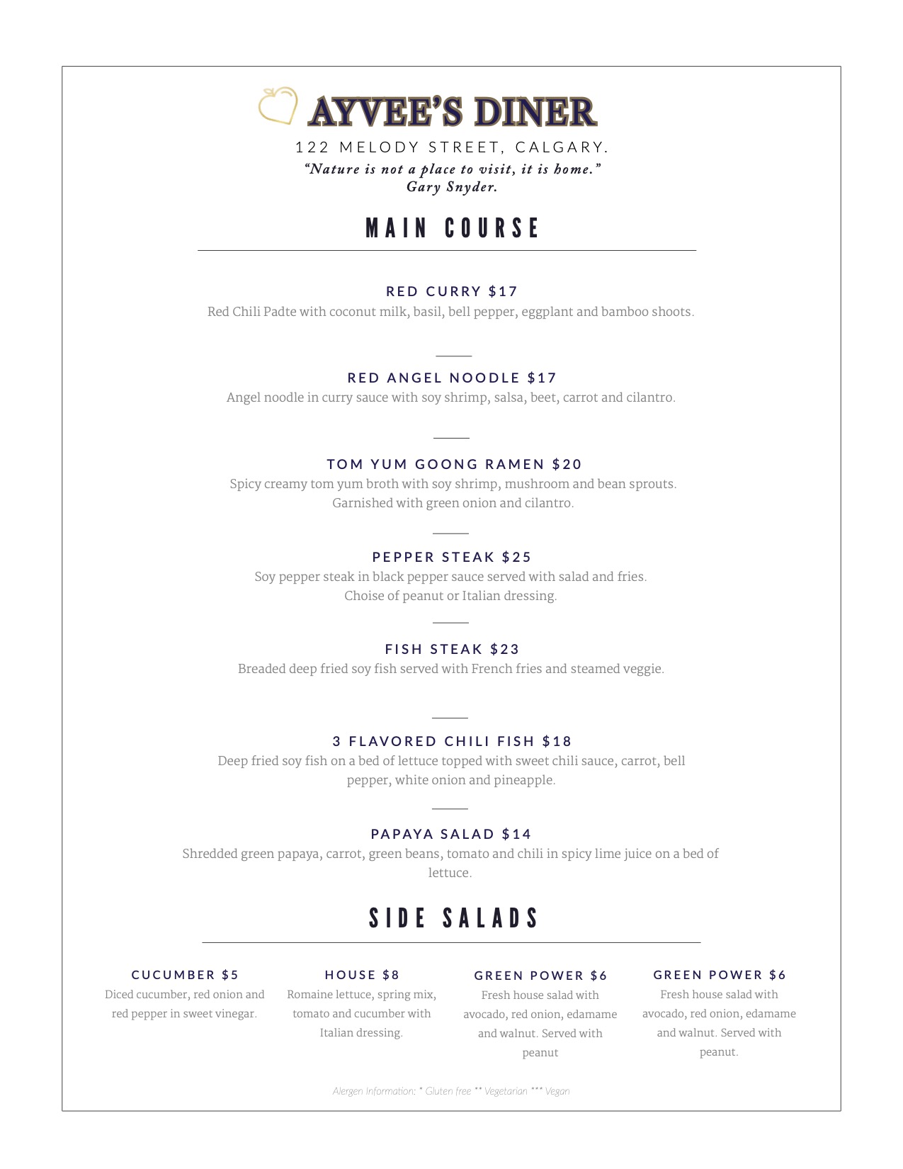
Typography distinguishes category headings, dish names, prices, and descriptions. Spacing and fine dividers separate entries, while recurring headings, the wordmark, and a consistent page frame connect the different categories. The layouts adapt to each menu’s content without losing their shared visual identity.
Design Decisions
Why it looks this way.
- 01
One typographic system
Consistent typography, section headings and restrained dividers repeat across every menu, so each page belongs to the same system.
- 02
Readable entries
Dish names, descriptions, prices and categories are separated by type and spacing, making each page quick to scan.
- 03
Original artwork, unchanged
The menu pages are shown exactly as originally designed.
03 — Print application
From page to table.
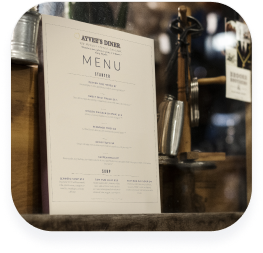
The printed menu and brand story carry the same identity into different reading contexts: a quick scan of dishes and a longer introduction to the restaurant concept.
This project brought together typography, spacing, and editorial structure to communicate clearly across multiple printed pages. A consistent visual language connects the menus and brand story while allowing each page to organize its own content.